

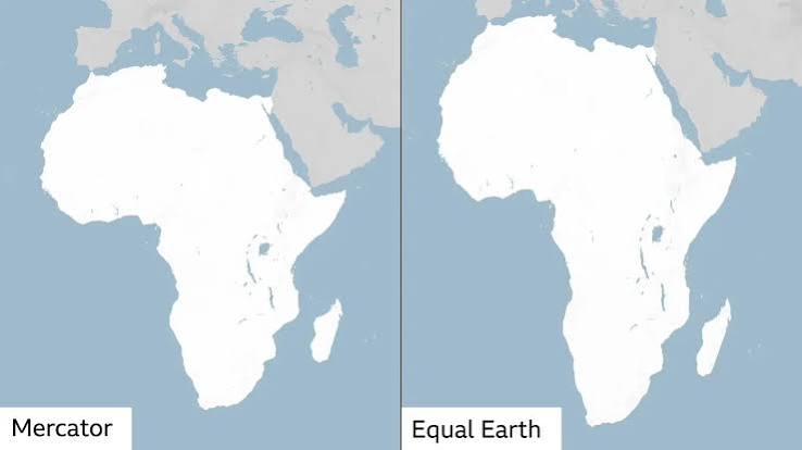
“Until the lion learns how to write, every story will glorify the hunter.” This ancient adage speaks to a profound truth about power, representation, and memory. He who controls the narrative dictates the boundaries of reality. For nearly five centuries, humanity has viewed itself through a deeply distorted lens, relying on a visual framework that systematically shrinks the cradle of humanity while artificially inflating the Global North.
Imagine walking into a courtroom where a judge determines your legal compensation based on a trick mirror that makes you look half your physical size, while your neighbor is reflected at quadruple their volume. You would not argue that the mirror is a minor, cosmetic detail. You would demand a correct tool of measurement because your status, dignity, and wealth depend on it.
Discussing the distortion of the African continent on world maps at the United Nations General Assembly is not a matter of semantic subtlety or aesthetic pedantry. It is a fundamental debate about geopolitical equity, psychological liberation, and scientific truth. A map is never neutral; it shapes perceptions and inherently influences how the place of peoples and continents in the world is understood.
The Weight of Cartographic Evidence: Dismantling the Mercator Illusion
To appreciate why this issue reached the highest levels of global diplomacy, one must look at the rigid, unyielding metrics of geometry and geography. The traditional map hanging in most classrooms today is the Mercator projection, engineered by Flemish cartographer Gerardus Mercator in 1569. Crucially, Mercator did not design his map to teach geography; he designed it strictly as a calculation tool for European marine navigation.
Because the Earth is a three-dimensional sphere, flattening it onto a two-dimensional sheet of paper requires a mathematical compromise. Mercator chose to preserve straight lines of direction (rhumb lines), which allowed sailors to navigate constant compass bearings across oceans. To achieve this, his formula stretched lines of latitude increasingly as they moved away from the equator and toward the poles.
The byproduct of this 16th-century compromise is a staggering distortion that heavily favors northern landmasses while severely compressing the equatorial belt:
- The Greenland Illusion: On a Mercator map, Greenland and Africa appear roughly identical in size. In factual reality, Africa spans 30.3 million square kilometers, while Greenland covers just 2.1 million square kilometers. Africa is 14 times larger.
- The Continental Container: Africa is so massive that the entire landmasses of the United States, China, India, Japan, and the vast majority of Europe can fit simultaneously inside its borders with room to spare.
- The Northern Inflation: Russia appears to overwhelm Africa on a standard map, yet Africa is nearly double the total landmass of Russia (~17.1 million square kilometers).
- The Truncated Triad: Western nations like the United States, Russia, and China take on a disproportionate visual prominence compared to Africa, Latin America, or Southeast Asia.
When a map minimizes a continent’s physical scale, it subtly primes the human brain to minimize its geopolitical importance, resource capacity, and demographic weight. An old Yoruba adage reminds us, “A man who does not know where the rain began to beat him cannot know where he dried his body.” The rain of visual distortion began with colonial cartography; drying ourselves requires reclaiming the true dimensions of our world.
Dismantling the Counter-Arguments and Cynicism
The recent UN resolution—spearheaded by Togo and backed aggressively by the 54 member states of the African Union under the “Correct the Map” campaign—passed with a resounding 164 votes in favor. However, the decision faced sharp institutional pushback. The United States cast the sole opposing vote, dismissing the resolution as a “superfluous” distraction driven by a “radical ideological project”. American representatives argued that the UN General Assembly was wasting its credibility debating centuries-old map projects rather than addressing immediate crises of international peace and prosperity.
This counter-argument crumbles under the weight of historical and psychological scrutiny. To call the correction of a 450-year-old error “superfluous” is to ignore the weaponization of information. Cartography has never been a detached, objective science; it has always been an instrument of empire. Shrinking Africa while inflating colonizing nations visually normalized the myth of European dominance and African insignificance. Advocacy groups like Africa No Filter correctly point out that this distortion represents the world’s longest-running misinformation and disinformation campaign.
Critics also argue that alternative equal-area maps, such as the newly adopted 2018 Equal Earth projection, introduce their own distortions by stretching or flattening the shapes of continents along the edges. While it is a mathematical fact that no flat map can be entirely perfect, the choice of what to distort is a political and ethical one. For half a millennium, global institutions preferred to sacrifice the truth of area to preserve shapes convenient for European colonial trade routes. Prioritizing area over shape is not an ideological distortion; it is a corrective measure that values human populations and actual landmass over obsolete maritime bearings. As the saying goes, “Truth passes through fire and does not burn.” The geometric facts do not lie.
The Economic Consequences: Subconscious Bias in Global Policy
The distortion of the map is not just an academic grievance; it dictates how real wealth moves across the globe. Human brains rely heavily on visual heuristics. When corporate executives, global investors, and international policy analysts stare at a Mercator map for their entire lives, a subconscious economic bias is hardwired into their decision-making.
This visual minimization manifests in several critical ways:
- The Infrastructure Disconnect: Because Africa appears smaller on standard maps, international observers routinely underestimate the sheer distance, capital, and infrastructure required to connect African markets. Logistical strategies designed for Europe or North America fail on a continent where moving goods across a single region spans the distance of an entire ocean.
- Perception of Risk and Value: In international development and risk assessment, the relative size of a region often correlates to its perceived market capacity. By compressing Africa, the Mercator map visually diminishes its vast agricultural potential, massive mineral reserves, and consumer market capacity.
- The Allocation of Global Funds: Humanitarian and development aid distributions are frequently driven by institutional mindsets that view Africa as a singular, small, dependent locality rather than a vast, hyper-complex network of 54 distinct nations. A true-scale map changes the conversation from “aiding a small region” to “investing in a massive, integral pillar of the global economy.”
The Digital Cartography Problem: Upgrading the Code
In the modern era, the battle for a fair map has shifted from physical paper to digital pixels. Tech conglomerates dictate how billions of people interact with geography daily. While the UN resolution targets educational and diplomatic institutions, the real frontline is written in software code.
The technical challenge lies in how digital interfaces handle map scaling:
- The Web Mercator Problem: Major digital mapping engines rely on a variant called Web Mercator. This code is computationally efficient for zooming seamlessly into local street levels, as it preserves perfect 90-degree intersection angles. However, when users zoom out to look at the entire planet, the software defaults to the traditional Mercator distortion, giving billions of users a skewed macro-view of the world.
- The Fix is Algorithmic: Transitioning to a fair world view does not require scraping existing navigation technology. Tech platforms must implement adaptive projection algorithms. When a user is navigating local streets, the map should preserve angles. However, when the view zooms out beyond a specific threshold to display continents, the system must dynamically morph into an equal-area projection like the Equal Earth map.
- The Power of the Default: Human behavior is dictated by default settings. If tech platforms change their default global view to an equal-area projection, centuries of visual misinformation can be unlearned quietly and efficiently with a single software update.
A Pragmatic Blueprint for Unlearning and Relearning
A UN resolution is non-binding and non-enforceable; it cannot automatically erase centuries of cognitive bias. True systemic shift requires a coordinated, pragmatic blueprint to ensure the old map is unlearned and the true demographics, history, and scale of Africa are permanently integrated into global systems.
1. Educational Curriculum Overhauls
Ministries of Education across Africa, and progressive school boards globally, must mandate the immediate retirement of Mercator maps in classrooms. Togo has already pledged to integrate the Equal Earth map into its schools by the end of the year. Children must grow up looking at a world where their home continent reflects its true physical and psychological weight.
2. Institutional Leadership and Policy Shifts
Western nations must follow the proactive example of France, which co-sponsored the UN resolution and announced that its Foreign Ministry will completely abandon the Mercator projection for official diplomatic and administrative use. International bodies, NGOs, and global governance institutions must audit and update their cartographic assets to align with equal-area projections.
3. Algorithmic and Digital Interface Upgrades
Global technology giants must update the default macro-views on their digital platforms, search engines, and news databases. While the Mercator projection remains mathematically necessary for street-level GPS navigation due to its precise local angles, there is no technical justification for digital atlases to default to a distorted Mercator perspective when a user zooms out to view the entire planet.
4. Recoupling Geography with Demographics
True mapping must extend beyond landmass to human capital. True-scale maps must be deployed alongside updated demographic overlays showing that Africa is the youngest, fastest-growing continent on Earth. By 2050, one in every four people on the planet will be African. Correcting the map prepares the global collective consciousness for a shifting geopolitical equilibrium.
A Call to Conscience
We cannot build an equitable global future on a foundation of geographical falsehoods. An old Hausa proverb counsels, “Fault stands on the back of your neighbor, but your own stands before your eyes.” For centuries, the world has looked directly at its own cartographic fault and chosen to look away.
Correcting the world map is not an act of charity or political correctness toward Africa; it is an act of liberation for the global conscience. To look at a true map is to look at the world with fundamental honesty. As Togo’s delegation neatly summarized before the UN assembly, “A fair world begins with a fair map.” Let us stand on the side of mathematical and historical truth, actively unlearning the distortions of an imperial past so we may rightly navigate a shared future.



No Comments
Join the DiscussionBe the first to join the discussion!